
In today’s competitive market, brands need to create their own distinctive identities to stand out and be successful. They need to attract their audience’s attention to get their brand message across. For that to be successful, graphic designers use typography to turn simple text into an effective visual tool. In this article, we’ll be exploring the importance of typography for your website and its effectiveness forming a unique brand identity.
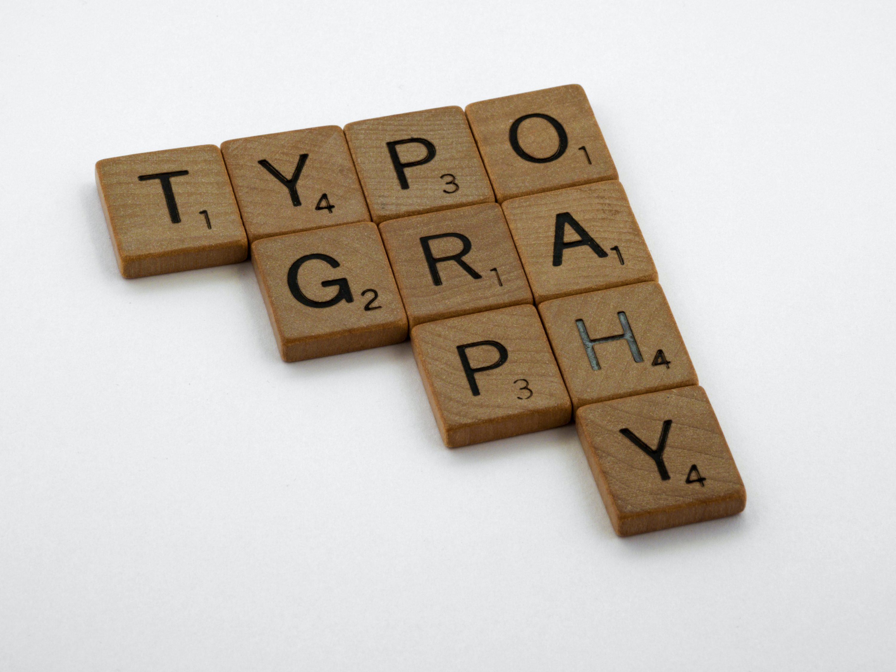
What is typography?
At a basic level, typography design involves organising a typeface in a variety of combinations of font, size, and spacing. This means that a broad range of marketing materials such as websites, brochures, books, computer graphics etc, relies on the skilful use of typography to make an impact on the consumer. Graphic designers use typography in website design to alter the text, which creates content with a purpose. The organised use of typefaces helps designers to make a piece of content look aesthetically pleasing.
Typefaces can be used strategically to ensure any text is readable and makes an impression on those reading it. With a combination of high-quality designs and unique typography ideas, brands can communicate with their audience in an effective way.
Typography enables designers to produce engaging visuals for brands. Designers take into account some important factors when using typography. They make key decisions relating to font choice, size, body text, white space, placement, and other elements of typeface.

Why is typography important?
Typography design serves multiple purposes, from making the words on a page legible to evoking emotion to producing a clear and consistent brand identity. A brand logo that includes good typographic elements can lead to consumers perceiving the business positively and visually pleasing font combinations helps to make presentations look more dynamic and exciting. Effective typography should keep viewers’ attention without it being too overpowering and distracting.
How does typography shape a brand?
There are several different elements to typography in web design that all work to effectively shape a brand’s identity and the message they want to convey to their audience.
Typeface
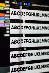
Typeface is a specific style of letter work and punctuation marks that share a common design. As part of any typeface, there will be a family of fonts that can be adjusted to different sizes, thicknesses (known as weights), or styles. The main design of the letter work though is called the typeface. Typefaces were first introduced with the invention of the printing press and are standard in digital word processing programmes used today.
Font
A font is a subset of a typeface that is made by changing the original typeface. For example, Arial Narrow is characterised by thinner lines and Arial Black is identifiable by its heavier lines, but they are both fonts that were created from the same Arial typeface. Fonts can fall under three main categories: calligraphy, serif, and sans serif fonts.

Type size
The height of a character is based around the x-height, or the space between the baseline and the median line for lower case text. The parts of the letter that reach above the x-height are ascenders whilst the parts that go below the baseline are descenders.
Alignment
Alignment is the process of arranging the edges of a body text to the edge of a page or text box. The different types of alignment include left alignment, centred, right alignment, and justified. Left alignment is most commonly used as the majority of modern languages are laid out in a left-to-right format.
Justified alignment produces a block of text by making each row of text fill the full length of the text box. When aligning the body text, you need to also keep line length in mind. You might have to alter the space between words of letters to form a balanced line that is easy to read.
Tracking
When you’re spacing out all the letters in a word or line of text, this is known as letter spacing, or tracking. In most cases, word processing programmes will have a default tracking setting for different fonts. Increasing the tracking will put more space in between the letters.
This can be effective in making words seem lighter and easier on the eye, but too much tracking will cause the words to be hard to read. Normally, uppercase letters can handle increased tracking better than lowercase letters.
Kerning
Kerning is where the space between individual letters is adjusted. This enables more fine-tuning than can be done with tracking, which impacts finished words and lines. Tracking is useful for designing a consistent body of similarly shaped text, whilst kerning is more suitable when making letterforms with flourishes more visually appealing.
Leading
Leading is the term used to describe the process of adjusting vertical spacing between lines of text. It is often implemented in order to convey a specific mood with a body of text. Also, it can be helpful when a font’s ascenders or descenders extend beyond the line height. When this happens, altering the leading will help to ensure the words are legible to make a better reading experience for the user.
Why is typography important in website design?
Almost all websites and designs use content in some way, which means there has been careful use of typography. Text-based content is essential to bringing in visitors and keeping them interested in your website. With that in mind, they should be able to read and understand the content easily.
Therefore, graphic designers understand the importance of typography. Below are just some of the reasons why typography is important in website design.
Establish a visual hierarchy
Experienced and knowledgeable designers like the team at Deliver Media can make good use of various font sizes and types to focus a visitor’s attention on the most important information on a page first. The viewer can find the information they need by taking a quick scan, which helps in preventing them from bouncing off your website. This is successfully achieved by using different font sizes for the heading, subheadings, and the body of text.
Builds recognition
Brand recognition is essential for businesses to put themselves ahead of the competition. In the field of graphic design, fonts are the visuals that the target audience store in their memory over time. It is these visuals that allow a business to generate recognition amongst its customers. A lot of well-known logos are typography based and they are instantly recognisable.
So, careful use of website typography is vital to ensuring you have the desired effect on your audience and how they should view your brand. Coca-Cola, Google, and Disney are all great examples of an easily identifiable typography logo due to how they have used typefaces.
![]()
Gives value and tone to your brand
Typography is also useful in establishing the values and tones of a brand. Every typeface has the power to represent businesses in different ways when it comes to what they do and what they stand for. It is this exact reason why there are so many different kinds of typefaces as they reflect various moods and effects through a design.
The audience understands a design by taking in its message. So, the designers include the fonts that set the tone to demonstrate and convey a message.
Give a design personality
Another characteristic of typography design is that it gives a design a personality. Your design or web pages can look friendly, high-end, playful, or serious etc, depending on the strategic use of typefaces. Certain typefaces can be used to show the traits of a brand. Various typefaces and fonts will have different characters and meaning, which a designer uses to assign personality to a design.
Make a visual impact
Typography is also an important part of creating an impression on your target audience. Nowadays it’s common for websites to have larger fonts in order to make a bold visual impact and inform users of the main message and purpose of the content. For this reason, you’ll often see websites that have larger headers that resemble the cover of a book.
Conclusion
Typography is an essential part of your website that you shouldn’t underestimate. It tells your audience who you are as a business and a brand by providing information in a visually appealing way with your intended tone and message being at the forefront of your typography choices. If you think your website needs redesigning to better reflect the personality of your business and to improve your lead generation, contact Deliver Media today.